


For months Andrew Bridgen MP, the red-pilled former Tory independent turned sole member of parliament for Lawrence Fox’s Reclaim UK, has been calling for a debate in parliament over the number of excess deaths in England and Wales since the start of the pandemic – or more accurately, given Bridgen’s many public proclamations, since the start of the COVID-19 vaccine rollout.
On Friday 20th October 2023, he finally got that debate – a half hour slot in which he could robustly debate his case. The room was all but empty, which his supporters have claimed is a damning indictment of the level of scrutiny this issue will receive, and even, according to some, proof of complicity by the MPs in parliament, who they believe are part of the national cover-up of the vaccine scandal.

That said, had the room been full to capacity, with every MP present, how much of a debate would have been had is questionable, given that this 30-minute debate consisted of Bridgen giving an opening statement that lasted for almost 25 minutes.
In it, he claimed:
There will be a full press pack going out to all media outlets following my speech, with all the evidence to back up all the claims I will make, but I do not doubt that there will be no mention of it in the mainstream media.
Unfortunately, The Skeptic is not the mainstream media, so Andrew didn’t send the pack through to us. Nor did he respond to any of the times we contacted him asking for a copy of the pack. However, the Health Advisory and Recovery Team – aka HART, a British pressure group opposed to COVID-19 mitigation measures and COVID-19 vaccines – have published a copy of his speech interspersed with the data he was referring to, with which we can fact check the MP and the claims he made in parliament.
Bridgen opened the speech by saying:
We have experienced more excess deaths since July 2021 than in the whole of 2020.
Here, HART provides evidence, pointing out that there were 69,293 excess deaths from March to December 2020, but then from July 2021 to September 2023, there have been 76,554 excess deaths. This does actually appear to be right… but it is also an astonishingly misleading way of presenting those particular figures. March to December 2020 is ten months, giving an average excess death per month of 6,929. By comparison, July 2021 to September 2023 is a period of twenty-seven months, averaging 2,846 excess deaths per month – which is less than half of the excess mortality of the previous period. In essence, Bridgen’s point amounts to “isn’t it weird that there were fewer excess deaths in a period of ten months than there were in a period nearly three times as long”. No, that’s not weird.
The other way this is misleading is in what it misses out: Bridgen specifically cited March to December 2020, and then July 2021 to September 2023. That omission can’t help but feel like an act of cherry-picking, and could be a sign of packaging up the data to form the most damning picture possible. To present the data more fairly, we can group the excess deaths by year:
| Year | Excess | Average per month |
| Last 10 months of 2020 | 69,293 | 6,929 |
| 2021 | 44,548 | 3,712 |
| 2022 | 30,614 | 2,551 |
| First 9 months of 2023 | 23,301 | 2,589 |
Once we do that, the figures are clearly far less indicative of a growing problem than Bridgen characterised. So, let’s have that debate about excess deaths, Andrew: from the full ONS data, we’ve seen a huge fall since 2020’s excess deaths, and now we’re settling at around an excess of 2,500 per month. Bearing in mind, too, that Covid is still very much around.
That covers the first fifteen words of his four-thousand-word speech. This could be a long exercise. He continued:
Unlike during the pandemic, however, those deaths are not disproportionately of the old. In other words, the excess deaths are striking down people in the prime of life, but no one seems to care.
Is it true that the excess deaths shifted from “disproportionately of the old” in 2020, to “people in the prime of life” in 2023? Helpfully, HART provide screenshots of ONS data for this too, though their by-year snapshots don’t make comparisons across years particularly easy (see 2020-21, 2021-22, and 2023).
To solve this, we can collate just the excess deaths column into a table summarising by year and by age group. Even then, doing so could make these data seem worrying. For example, in 2020, 73% of excess deaths were in people 75 or above, but this dropped to just 53% of excess deaths in 2023. Meanwhile, 13% of excess deaths in 2020 were in people aged 25-64 – arguably “the prime of life”, from Bridgen’s emotive rhetoric – whereas that number leaps to 29% by 2023. That’s a huge leap in relative percentages.
| Age group | 2020 | 2021 | 2022 | 2023 |
| All | 70727 | 44548 | 30614 | 23001 |
| 0-24 | -0.60% | 0.25% | 1.10% | 1.79% |
| 25-49 | 2.38% | 6.17% | 4.73% | 6.52% |
| 50-64 | 10.58% | 22.25% | 19.74% | 22.95% |
| 65-74 | 14.31% | 21.07% | 15.81% | 15.40% |
| 75-84 | 31.36% | 26.69% | 24.07% | 22.99% |
| 85+ | 41.97% | 23.58% | 34.52% | 30.24% |
However, relative percentage figures can be misleading, especially given that what they were a percentage of – the total number of excess deaths – dropped significantly across those years. 13% of 70,000 excess deaths in 2020 is much higher than 29% of the 23,000 excess deaths in 2023.
Looking at the numbers in real terms gives a clearer picture: 51,863 additional people over the age of 75 died in 2020, compared to just 12,244 in that age bracket in 2023; for people aged 25-64, excess deaths in 2020 came to 9,162 and in 2023 it actually fell to 6,778. Excess deaths fell in the “prime of their lives” age group too, but just not as quickly as in the older group – partly because the older group was falling from a higher total, partly because lots of people in that older group had already died over the previous three years, and partly because the vaccine actually works and was protecting them from severe Covid cases.
| Age group | 2020 | 2021 | 2022 | 2023 |
| All | 70727 | 44548 | 30614 | 23001 |
| 0-24 | -423 | 113 | 337 | 412 |
| 25-49 | 1682 | 2750 | 1448 | 1500 |
| 50-64 | 7480 | 9913 | 6044 | 5278 |
| 65-74 | 10124 | 9388 | 4841 | 3543 |
| 75-84 | 22182 | 11888 | 7370 | 5289 |
| 85+ | 29681 | 10506 | 10568 | 6955 |
The numbers are even clearer when you look not at excess deaths but the actual numbers of people who died and whose death certificates included the word “Covid”. In 2020, 57,308 people aged 75 or above died with Covid on the death certificate, and so far in 2023 that’s just 10,575 – that’s not excess deaths, to be clear, that’s all Covid deaths. That number is still quite high, to be clear – we still lose around 1100 people per month across all ages to Covid – but much lower than it was. In 2020, 1,458 people aged under 50 died with Covid on their death certificate, and so far this year that number is just 235.
| Age group | 2020 | 2021 | 2022 | 2023 |
| All | 76632 | 76130 | 32349 | 13365 |
| 0-24 | 52 | 124 | 97 | 32 |
| 25-49 | 1406 | 2465 | 792 | 203 |
| 50-64 | 6360 | 8904 | 2499 | 842 |
| 65-74 | 11506 | 12957 | 4489 | 1713 |
| 75-84 | 25038 | 22367 | 9585 | 4219 |
| 85+ | 32270 | 29313 | 14887 | 6356 |
So, are we really seeing an epidemic among people “in the prime of their life”? Or are we witnessing an MP and a biased lobby group wildly cherry pick and distort data to tell the story they want to tell? We are now 50 words into this 4,000 word speech, but the picture is already quite clear.
Bridgen carried on, lamenting that he was the only one who cares about this issue, and how he has tried time and again to get this topic raised to the house floor, only to be rejected, even though “nothing could be more serious than this topic”. But nothing could be more unserious than the manner in which he, or whoever has prepared this data pack for him, have approached the statistics here – this is the antithesis of serious scholarship or honest research, and it does a disservice to the democratic process to see these convoluted stats aired in the chamber.
Bridgen continued to his next piece of evidence:
Numerous countries are currently gripped by a period of unexpected mortality, and no-one wants to talk about it. It is quite normal for death numbers to fluctuate up and down by chance alone but what we are seeing here is a pattern repeated across countries, and the rise has not let up.
HART kindly refer to a heat map showing the relative mortality for a range of countries, quarter by quarter, based on the baselines expected deaths for that region, and it looks daming, in that it’s lit up red with the many countries that are above their baseline, some very significantly so. But looking at their chart, the countries listed are, in order: Singapore, Qatar, Thailand, Chile, Japan, Puerto Rico, Taiwan, Scotland, England, and Wales, South Korea, Ireland, Finland, Oman, Ecuador, Egypt, Norway, New Zealand, South Africa, Sweden, Brazil, Netherlands, Australia.
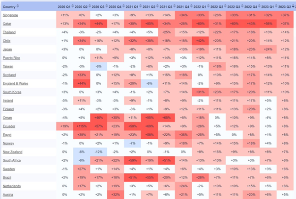
To understand the value of this data, we might question that list. Why would an analysis of excess mortality by country lead with Singapore, Qatar, Thailand, Chile? The answer is that the list has been sorted by the countries with the highest exess mortality percentage in Q2 of 2023 – an ordering you would only choose if you wanted to maximise the most worrying possible interpretation of the data.
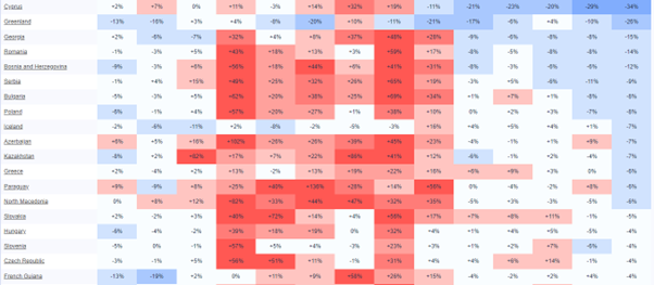
For a more reflective picture, we can go to the source of the data – a website called Mortality Watch. It’s not a site I was aware of previously, but let’s assume that its information is legitimate, as we’ve no reason to believe otherwise. A dishonest and trite way to rebuff Bridgen’s data would be to simply reverse the filter, and cite the same list ordered by countries with the most positive Q2 2023 first. Do that, and suddenly the picture looks so much healthier: there was an intensely bad period during 2021 and 2022 (perhaps related to the world being in the grip of a deadly and highly transmissible virus), but 2023 tells a picture of a calming, blue 2023 of mortality below the expected rates, dominated by Cyprus, Greenland, Georgia, Romania, Bosnia and Herzogovina, Serbia and Bulgaria.
Of course, this would be to commit the same data manipulation as Andrew Bridgen (or whoever prepared this data for him, if it was not him), and would be equally dishonest an exercise. Instead, we can put the data into alphabetical order, and try to get a global or holistic picture. We can also remove the countries for whom no 2023 data is available, as the absence of up to date data could throw out any analysis. Doing so, we have full data for 80 countries.
There is an initial confounding issue here: sourcing, and ensuring we are comparing apples to apples. Is the way excess mortality is worked out in England and Wales the same as how it’s worked out in Qatar, or Cyprus? Because if the methodology differs, the end result could result in entirely inappropriate conclusions (think, for example, about the myth of Sweden being the “rape capital of Europe”, which was driven entirely by Sweden choosing to record sex crimes at a more granular level than in other countries). We have no easy way of interrogating the excess mortality methodology of each country in this list, so we should avoid drawing too strong a conclusion from it.
Still, there is some indicative use for this data. As Bridgen himself said:
It is quite normal for death numbers to fluctuate up and down by chance alone
In any given period, some countries are going to be above or below their regular mortality figures. Perhaps a natural disaster, war or disease outbreak will end up recording far more deaths than expected. Perhaps after that happens, there might be a period where there are fewer deaths – because the people who were most vulnerable died off during the period of increased risk. Or maybe it’s just an unlucky period of time, in which there are more cancers and heart attackes than expected, by variation alone. Data is messy and noisy.
One, imperfect but indicative way of clearing out some of that noise is to look at very large datasets, where the effect of random chance will be diminshed. If we work out a global average of all countries’ excess death variance in each quarter, we might get a sense for whether this is regular noise, or whether there is something else at play (Bridgen’s hypothesis being that the mass vaccination program has led to an untold number of excess deaths).
If the variance was random, we might expect to see roughly as many countries above their baseline as below, very broadly speaking; anything that varied from that significantly could be suggestive that something else is at play (this isn’t perfect, of course, as it means a lower variance percentage for a small country could cancel out a higher variance percentage for a large country, obscuring a large real number of deaths along the way, but as an excerise it is handy if not conclusive).
Peforming that average across the 80 countries for which we have full data, there is a heavy excess mortality throughout late 2020 and 2021, as the virus took hold and wreaked havoc, with an average additional 20% deaths. However, the first quarter of 2023 saw just 4% additional excess deaths at a global level, and by the second quarter that number had fallen to just 1% additional excess deaths:
| Period | Average global variance |
| 2020 Q1 | 0% |
| 2020 Q2 | 8% |
| 2020 Q3 | 10% |
| 2020 Q4 | 24% |
| 2021 Q1 | 16% |
| 2021 Q2 | 18% |
| 2021 Q3 | 20% |
| 2021 Q4 | 23% |
| 2022 Q1 | 16% |
| 2022 Q2 | 6% |
| 2022 Q3 | 10% |
| 2022 Q4 | 9% |
| 2023 Q1 | 4% |
| 2023 Q2 | 1% |
All this is, of course, while Covid is still around: as we’ve seen, in the UK there are still around 1,100 Covid-related deaths per month. Some of those people may have died due to their other conditions while also having Covid, and some of those people might have been likely to die during the period anyway. Regardless, what is clear is that there is simply no evidence for the kind of substantial uplift in excess deaths that Andrew Bridgen and his supporters at HART were in parliament claiming.
Continuing to analyse Bridgen’s speech by this point, and after a short sidetrack (prompted by a brief, supportive interjection from Shipley’s Conservative Philip Davis MP) to accuse the media of having let the public down badly, Bridgen explained:
One might think that a debate about excess deaths would be full of numbers, but this speech does not contain many numbers, because most of the important numbers are being kept hidden. Other data has been oddly presented in a distorted way, and concerned people seeking to highlight important findings and ask questions have found themselves inexplicably under attack.
It is hard to see this as anything other than breathtaking hypocrisy from Bridgen, to accuse the official sources of data of being “oddly presented in a distorted way”, given the statisitcal orgami he has so far presented in this speech alone. He’s relatively right that his speech won’t contain many more numbers from this point, but I’d argue that’s because, quite simply, the data does not support his claims, and it would not be in his interest to cite it.
The next statistical claim that Bridgen made was:
There were nearly two extra deaths a day in the second half of 2021 among 15 to 19-year-old males, but potentially even more if those referred to the coroner were fully included.
Again HART provide a graph to back up Bridgen’s statement – this time the source is a graph on their own website, which looks at ONS data.
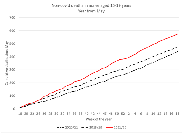
Yet, HART’s own analysis explains:
Cumulative total deaths in young males have stopped deviating from the 2015/2019 baseline and have been running parallel with it.
Which is to say, if there was something going on among this cohort, it has not continued.
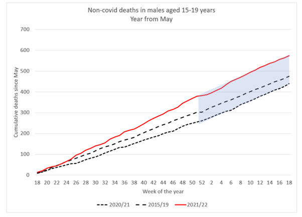
However, it is also worth bearing in mind that, from Bridgen’s own formation, he is talking about a cohort consisting of a 5-year age range – which in itself is a small chunk of the 0-24 age band in the ONS grouping. Of which he has split further by gender, to only look at males. Of which he has subdivided by six month periods, to only look at the latter half of 2021. And of all that, the variance is, cumulatively, less than 300 excess deaths. Is this really proof that the COVID-19 vaccine is disproportionally killing young men aged 15-19? Or is it simply an illustration of the principle that data is noisy, and that the more you subdivide it into smaller and smaller sub-categories along more and more axes, the more likely you are to find anomalies and outliers? By HART’s own analysis, the data has regressed to the mean – which suggests it is far more likely a data artifact than a real effect.
Bridgen went on to say that the ONS had been asked to explain this apparent rise in deaths among teenage boys in that six month period, and responded to say “more work could be undertaken to examine mortality rates of young people in 2021”, to which Bridgen indignantley asked:
How many more extra deaths in 15 to 19-year-olds will it take to trigger such work? Surely the ONS should be desperately keen to investigate deaths in young men.
To answer Bridgen here, according to the data he himself is citing, there weren’t any further extra deaths that might trigger such work.
Bridgen next jumped to older people, highlighting that deaths from dementia and Alzheimer’s show a period of high mortality “coinciding with covid and lockdowns” – a telling statement in itself, as it appears to imply that, for Bridgen, both the deadly virus and the measures taken to protect from the virus were equally deadly, a fact that is just not remotely supported by the evidence. But Bridgen rightly highlights that since then, we’ve seen fewer deaths than expected, because “you can’t die twice”. If the most vulnerable patients died in 2020, there are fewer extremely vulnerable patients in 2021.
Bridgen then carried on to make a claim that’s worth quoting at length:
Even for the over-85-year-olds, according to the Office for Health Improvement and Disparities, there were 8,000 excess deaths—4% above the expected levels—for the 12 months starting in July 2020. That includes all of the autumn 2020 wave of covid when we had tiering and the second lockdown and all of the first covid winter. However, for the year starting July 2022, there were more than 18,000 excess deaths in this age group—9% above expected levels.
There were just over 14,000 excess deaths in the under 65-year-olds before vaccination from April 2020 to the end of March 2021. However, since that time, there have been more than 21,000 excess deaths.
Once again, this is the statistical sleight of hand of the shifting time period – for one age group, we compare the twelve months from July 2020 to the twelve months from July 2022 (inviting the question: why start either period at July, if not to skew the data?). For the younger age group, we’re invited to compare the twelve month period from April 2020 to a 30 months period from March 2021.
But, of course, these deaths were already included in the ONS data we’ve previously analysed, and so we can go back to the summary with the statistical chicanery removed, and remind ourselves that exess deaths have clearly fallen from year to year, including across those categories:
| Age group | 2020 | 2021 | 2022 | 2023 |
| All | 70727 | 44548 | 30614 | 23001 |
| 0-24 | -423 | 113 | 337 | 412 |
| 25-49 | 1682 | 2750 | 1448 | 1500 |
| 50-64 | 7480 | 9913 | 6044 | 5278 |
| 65-74 | 10124 | 9388 | 4841 | 3543 |
| 75-84 | 22182 | 11888 | 7370 | 5289 |
| 85+ | 29681 | 10506 | 10568 | 6955 |
We could continue, and examine the remainder of Bridgen’s speech, given that we’ve barely made it through the first third, but to do so seems futile. What we’ve seen so far has been example after example of Bridgen allowing his pre-existing biases to colour his interpretation of the data, until he’s skewing and twisting it in quite extraordinary ways in order to make it sing the tune he wants to hear.
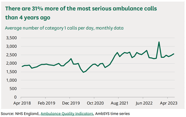
So when, next, he turns to ambulance data, and points out that there’s a rise in call outs for the most life-threatening of emergencies, why should we follow his innuendo that the cause is COVID-19 vaccines? Rather than, perhaps, continuing health issues as a result of Covid, or Long Covid, or the rising GP wait times which could lead to people requiring emergency care for untreated conditions?
Similarly, when Bridgen cites the rising figures of people on longterm sickness over the last few years, why should we follow him when he makes the connection to the vaccine rollout:
Claims for personal independence payments from people who have developed a disability and cannot work rocketed with the vaccine roll-out and have continued to rise ever since.
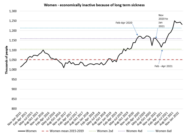
Why should we trust Bridgen’s analysis here, and trust that he’s considered and fairly ruled out the impact of Covid-caused disability, or any other confounding factors that could have arisen from an underfunded and stretched helathcare system? Especially given that he has already shown us, throughout this speech, that he struggles to present any data fairly and accurately?
Bridgen lamented that this debate was such a long time in coming, and then when it came, fewer than a dozen MPs attended it. Once it finally arrived, his 30 minute debate saw him give a 25 minute pre-prepared monologue, leaving just 5 minutes for anyone who disagreed with him at all. That is not a debate, and it is little wonder that the chamber was empty – it is also little wonder that the public gallery was full of Bridgen’s supporters, who could be heard cheering loudly as Bridgen told them what they wanted to hear, regardless of how distorted the data had to be to do so.
With all the time Andrew Bridgen MP had to prepare for this spectacle, it’s a shame he spent so much of it writing a speech that painted himself as a brave, lone crusader, and spent so little time actually interrogating his statistics and checking his facts.
If he truly felt like this was an important topic of discussion, it’s a shame honest discussion seems to have been the last thing on his mind.